Building React Component Library - Configure Vite and Tailwind - [1/3]
In this post, I will walk you through building a React component library using Vite and Tailwind. We will also see how to publish it to npm and use it in a React application. We will integrate auto for versioning and release notes.
This is part 1 of the series. Here are the parts:
Requirements
- We will create a react component library using Vite and Tailwind
- We will publish the component library to npm
- We will publish documentation to GitHub pages using Docusaurus
- Make all this setup in a monorepo built with Lerna
- Automate Release Versioning & Release Notes using auto
Setup
Initialize Codebase
We will use Lerna to set up our codebase and add Docusaurus for documentation.
npx lerna init --packages="packages/*" --packages="apps/*"
Create Docusaurus App
npx create-docusaurus@latest apps/docs classic --typescript
Create Vite React App
Run the following command
npm create vite@latest packages/elements -- --template react-ts
Change package name
Change the name in package.json to @rcls/elements (actually to something you like)
Setup scripts
Add the following scripts to root package.json
loading...
Test Setup
- Build docs:
npm run docs:build - Build package:
npm run package:build - Build everything:
npm run build
If both of these work, then the setup is complete. If anything seems to fail, you can clean the repo and build again using npx lerna clean -y && npm install
Push to Github
Create a github public repo on Github and push the codebase to it, as in the following steps we would be using github actions.
Setup Component Library
Install Tailwind 3
Note that we are installing Tailwind 3 here; we will have an alternate section to do the same with Tailwind V4.
Go to the package directory cd packages/elements
npm install -D tailwindcss postcss autoprefixer tailwindcss-scoped-preflight
npx tailwindcss init -p --ts
Update tailwind config to:
loading...
Let's note a few things that we have done here:
- We added the prefix
- We scope preflight
We did both of these things so that our component styles would not override the styles of the app where we installed our component package.
twp is the scoping class that will force Tailwind preflight classes to be valid only when there is class="twp" on an element or the parent wrapper.
Add index.css
- Delete default
src/index.css - Add index.css file at
packages/elements/index.csswith the following contents
@tailwind base;
@tailwind components;
@tailwind utilities;
Test Tailwind
Replace App.jsx default content with the following:
import "../index.css";

export default function App() {
  return <h1 className="twp el-text-3xl el-font-bold el-bg-red-400 el-underline">Hello world!</h1>;
}
Implement Components
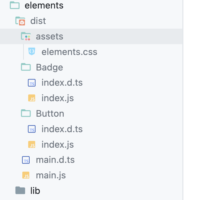
In this section, we will implement a couple of components and a couple of components. I have added two components to demonstrate a build that can be tree-shaken.
Run npm run package:dev, and you should see Hello World in the red background! This is a temporary change to test whether Tailwind is working correctly before we proceed to library changes.
- Button
- Badge
- main
loading...
loading...
loading...
Configure Vite for Library
Prepare Vite
Install dependencies
Run the following command inside your package folder, not the root folder.
npm i -D vite-plugin-dts react react-dom
Next, we configure Vite so that we can leverage its lib mode and build our package.
- package.json
- tsconfig.lib.json
- vite.config.ts
- vite-env.d.ts
loading...
loading...
loading...
loading...
Let's understand what we are doing above:
- We allowed public access so that we can push to npm
- In package.json, we configure what would be exported and also mark React as peerDependency so that it won't get installed when someone installs our package
- We are also exporting our .css file, so make sure the file's name matches what's generated in your repo. The file name would be the package name.
- We are configuring lib mode in vite file to generate build files, exclude a few packages, and prepare types
Run Dev
Add App.tsx
loading...
From the root folder, run npm run package:dev, and you should see your button and label component with proper styling. If not, stop here and debug it further.
Run Build
If the dev works fine, we will just run npm run package:build. This should go smoothly.
It has been a long journey till here, pat your back. We have much more to do. Next, we will publish this package to npm.